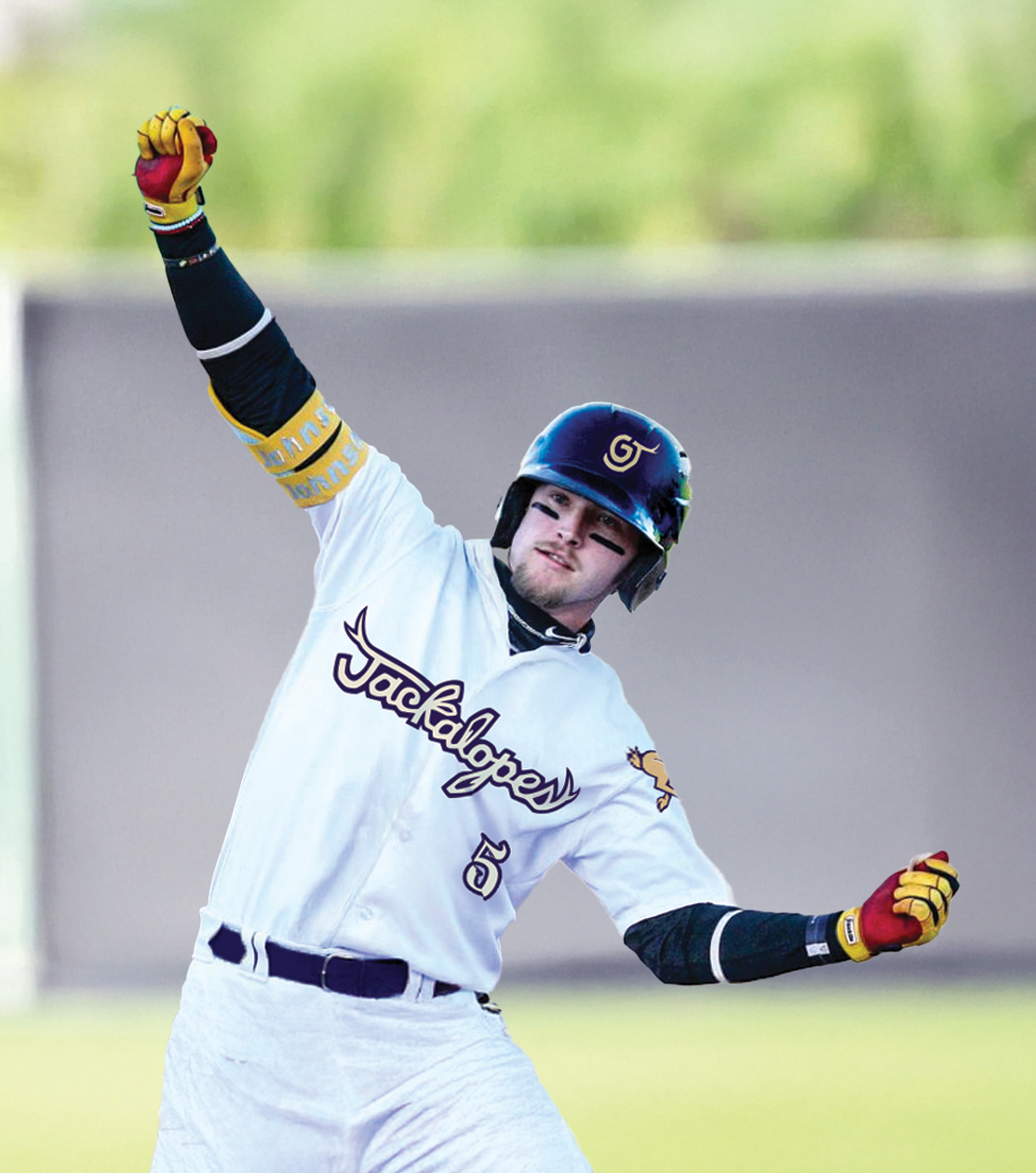
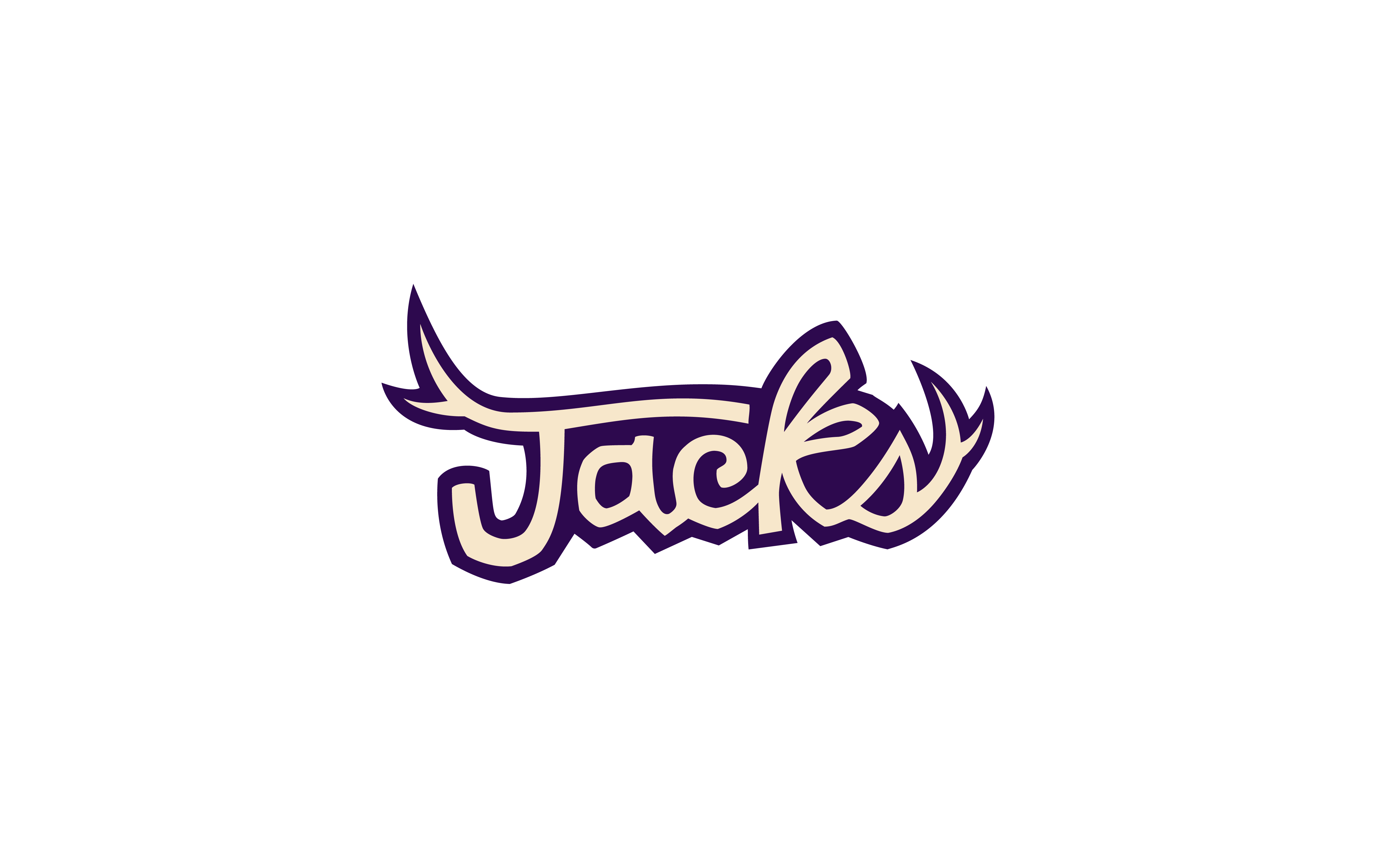
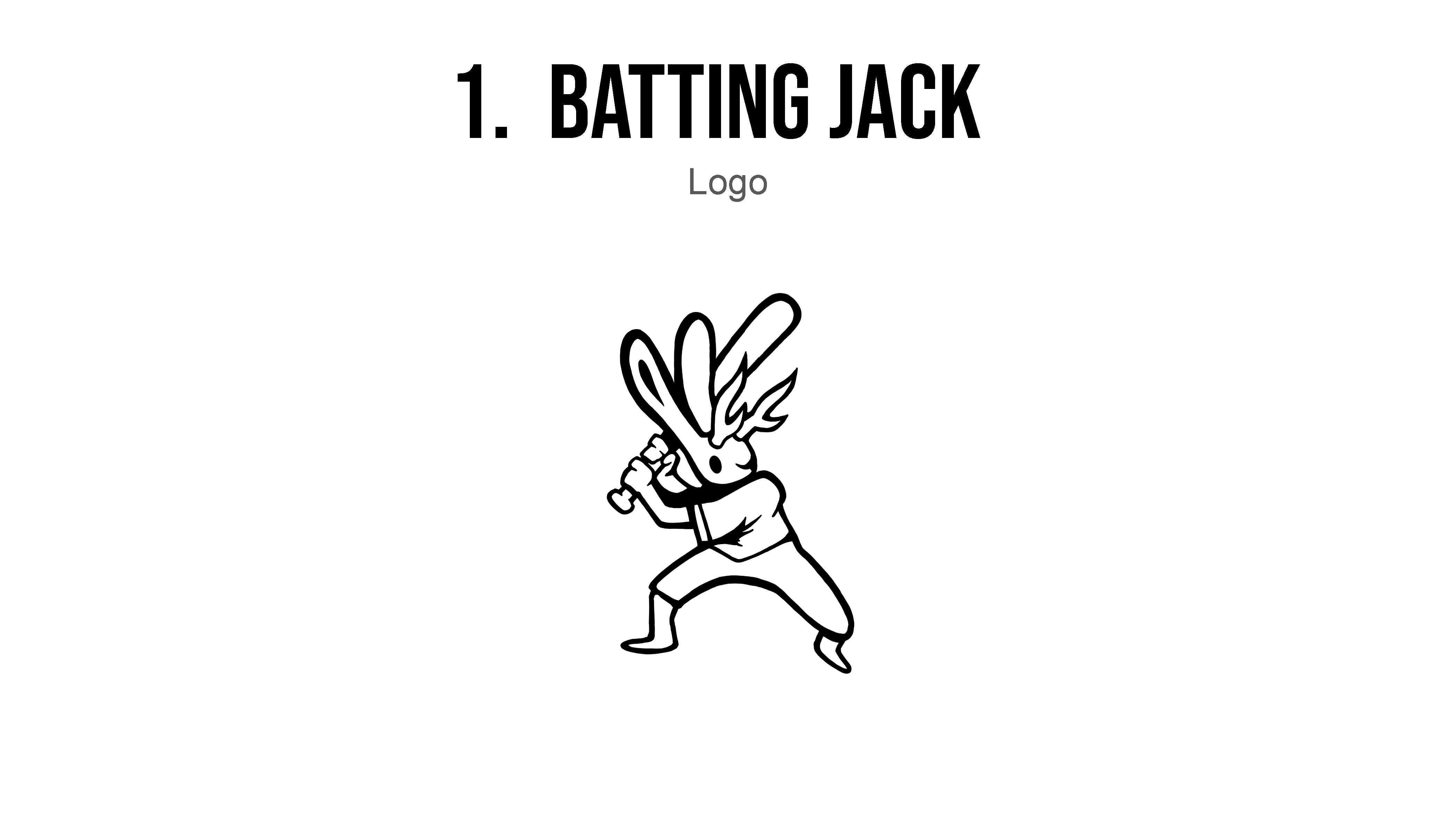
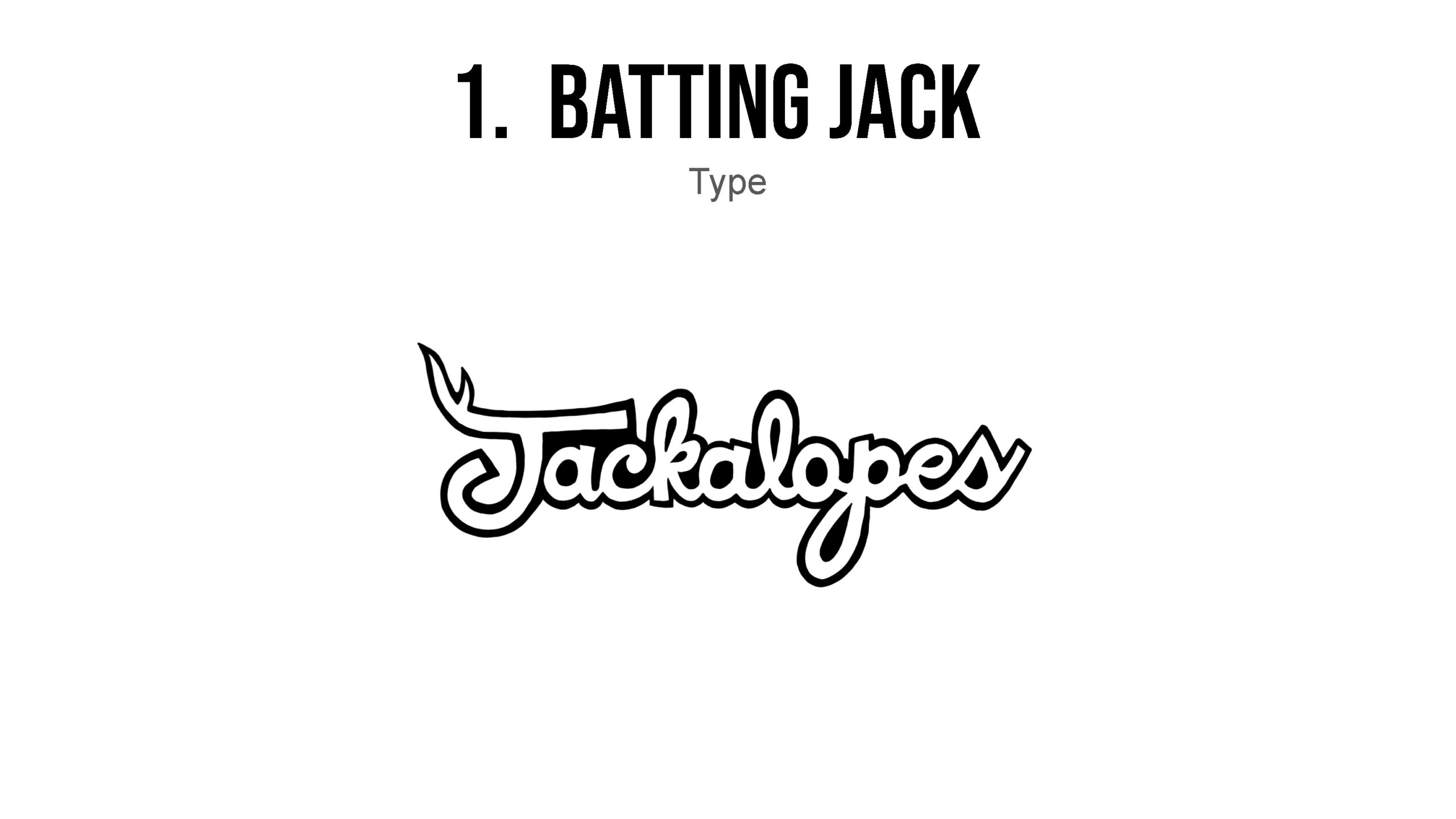
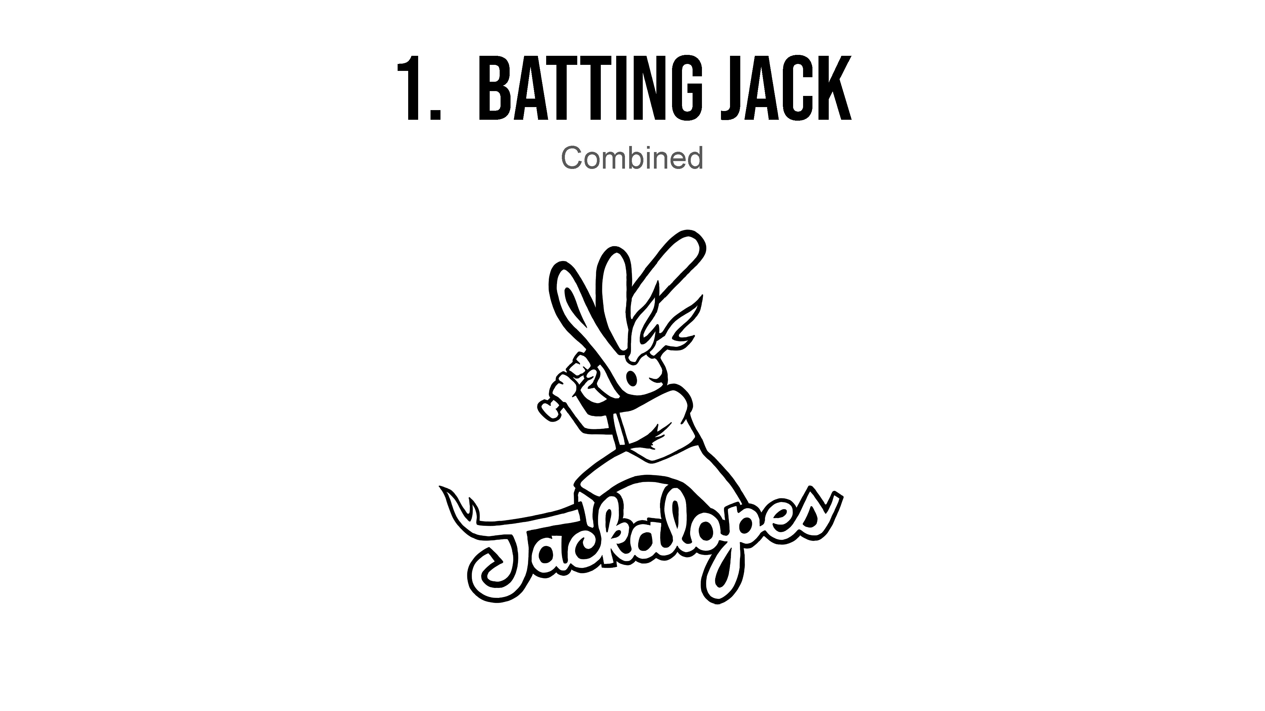
The Grand Junction Jackalopes, a Minor League-affiliated baseball club, sought to refresh their existing branding. They hired Ryan Earley and me to develop a new set of logos that would better represent both their target demographic and the team’s identity. The updated designs maintained the original name and a similar color palette, while introducing a fresh, modern aesthetic.
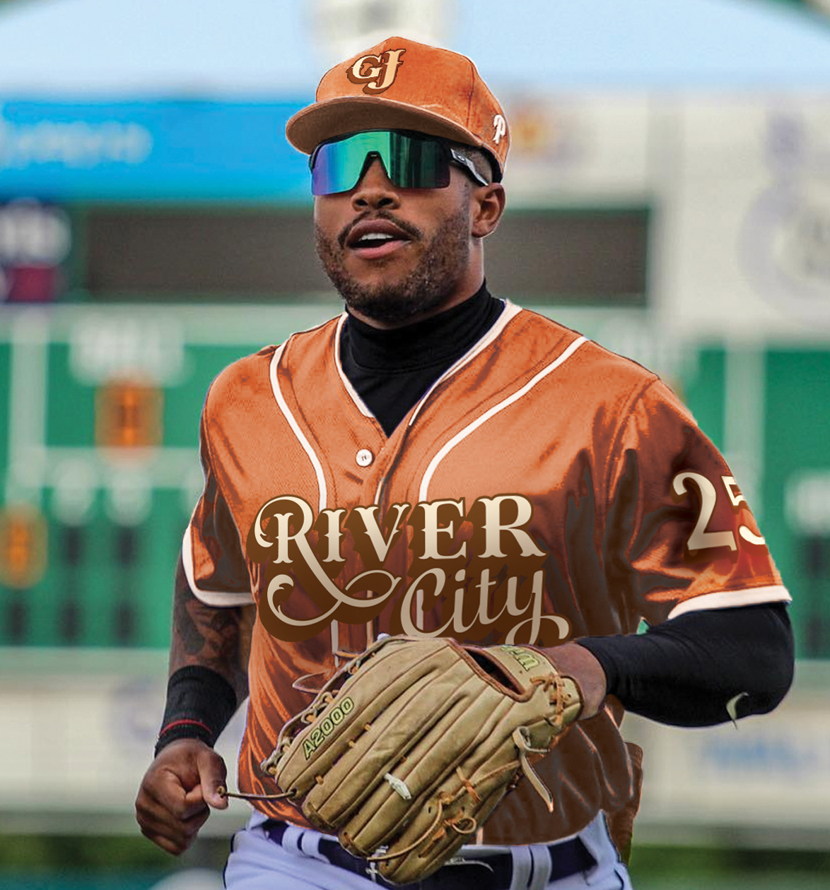
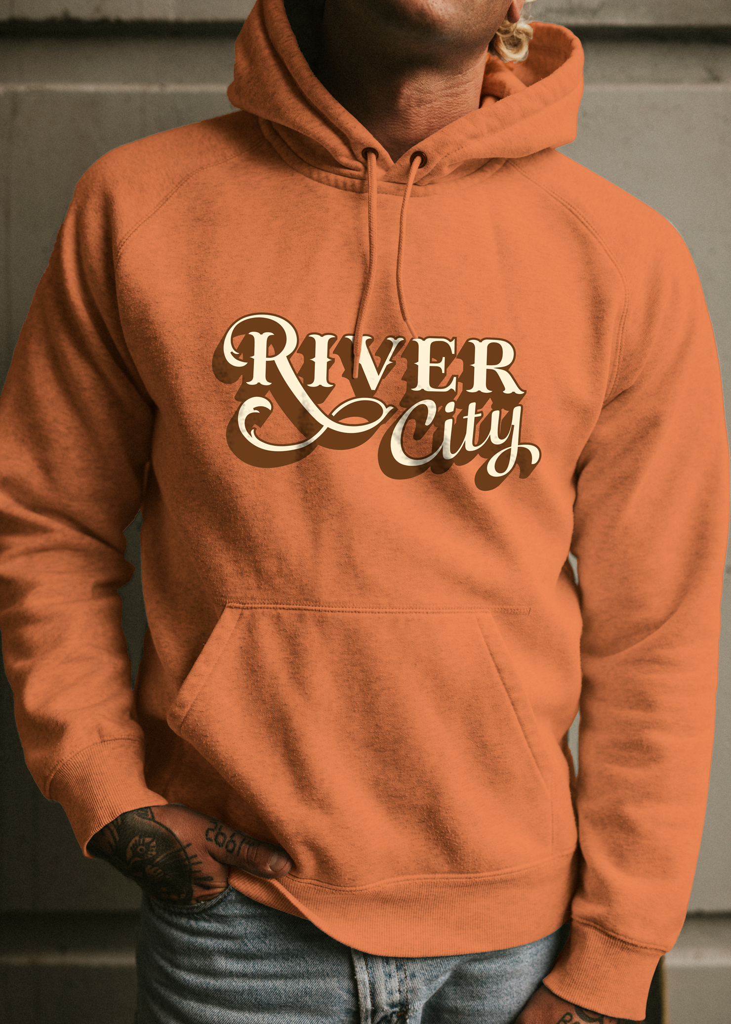
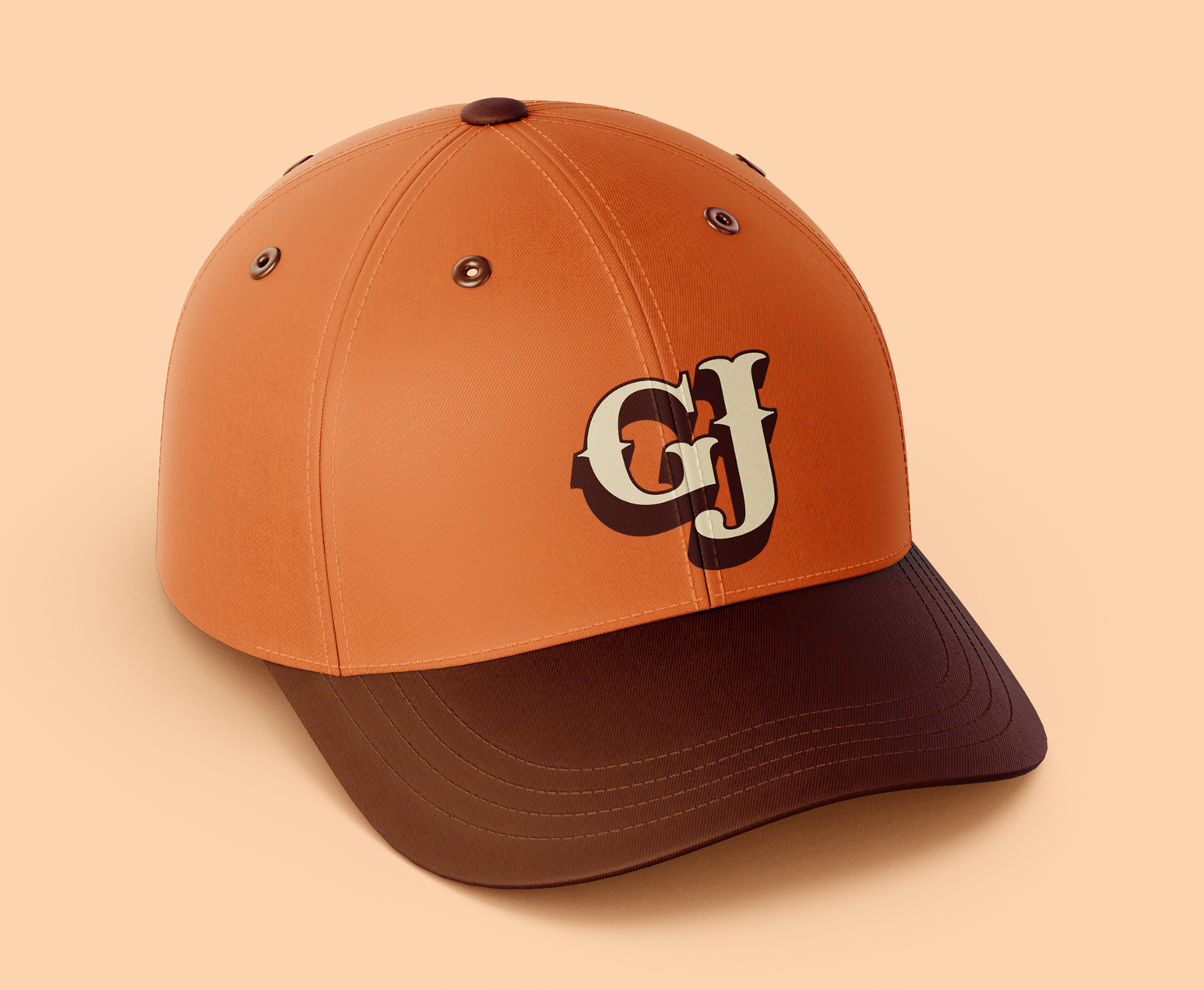
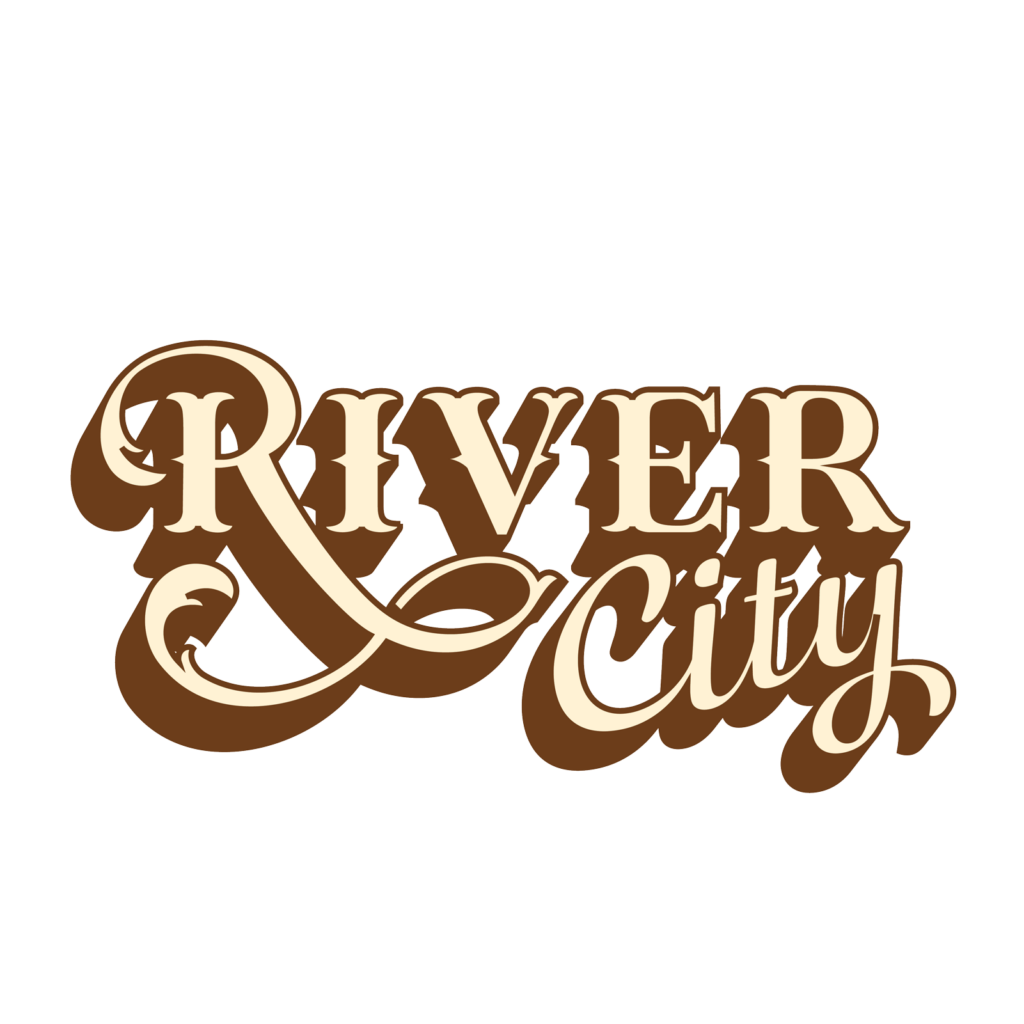
As part of the rebrand, we also developed a City Connect logo—an alternate mark designed for home games to reflect the local culture and regional character. Ryan and I worked collaboratively throughout the process to meet deadlines and deliver a cohesive, dynamic visual identity for the club.
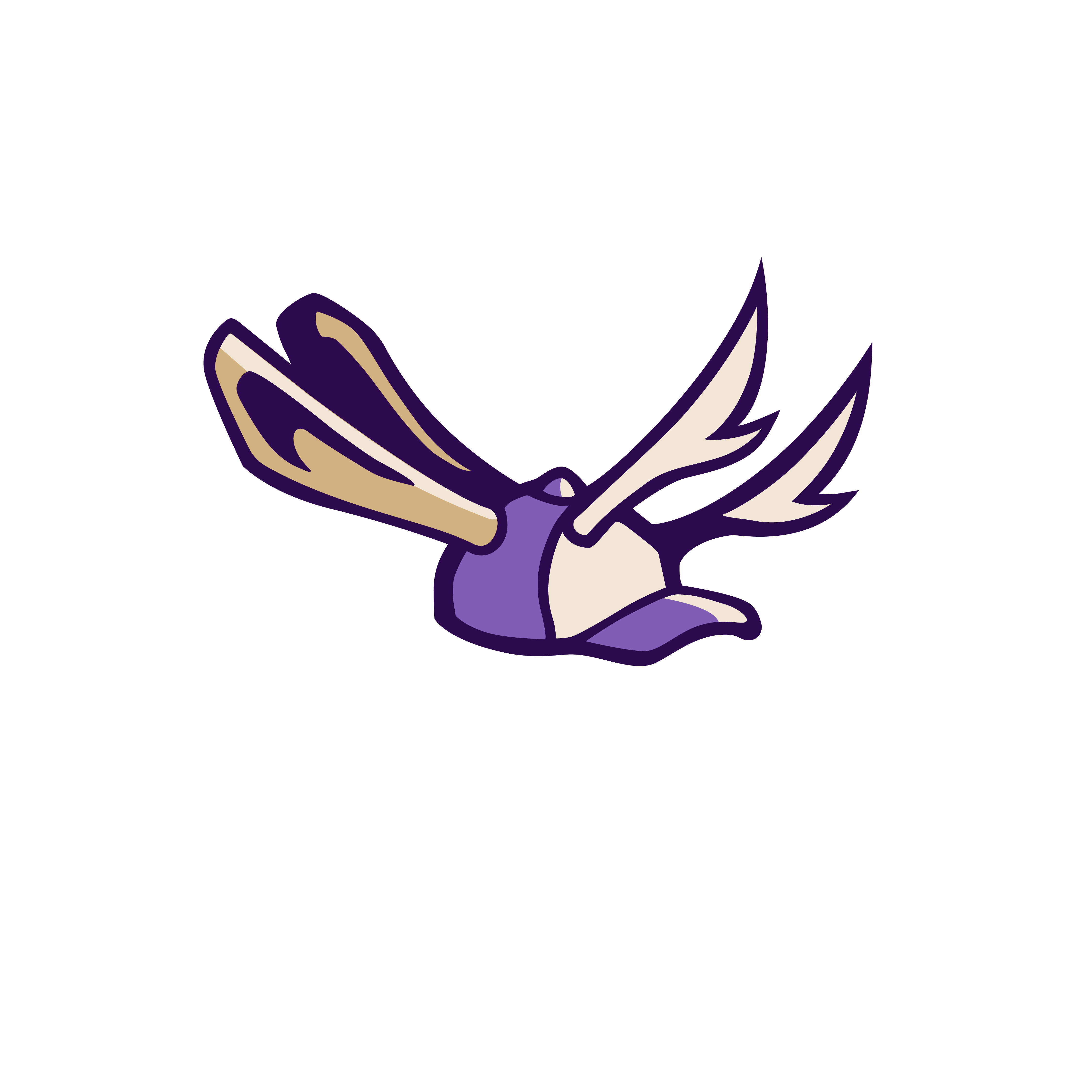
old logo
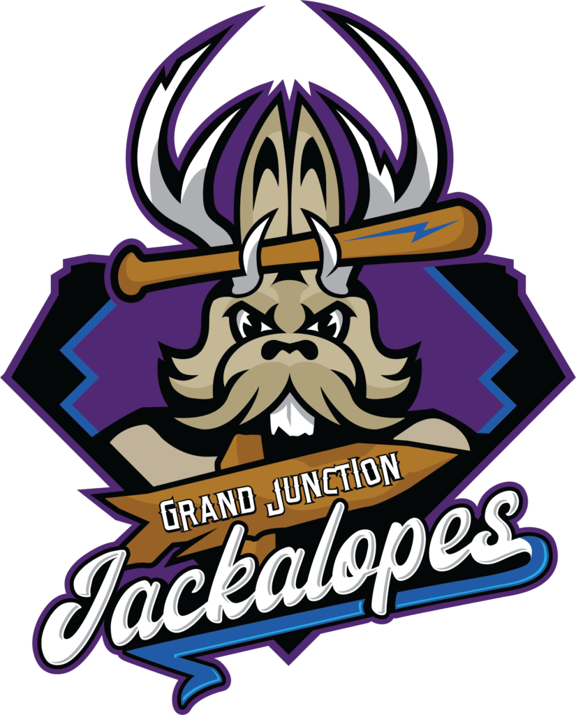
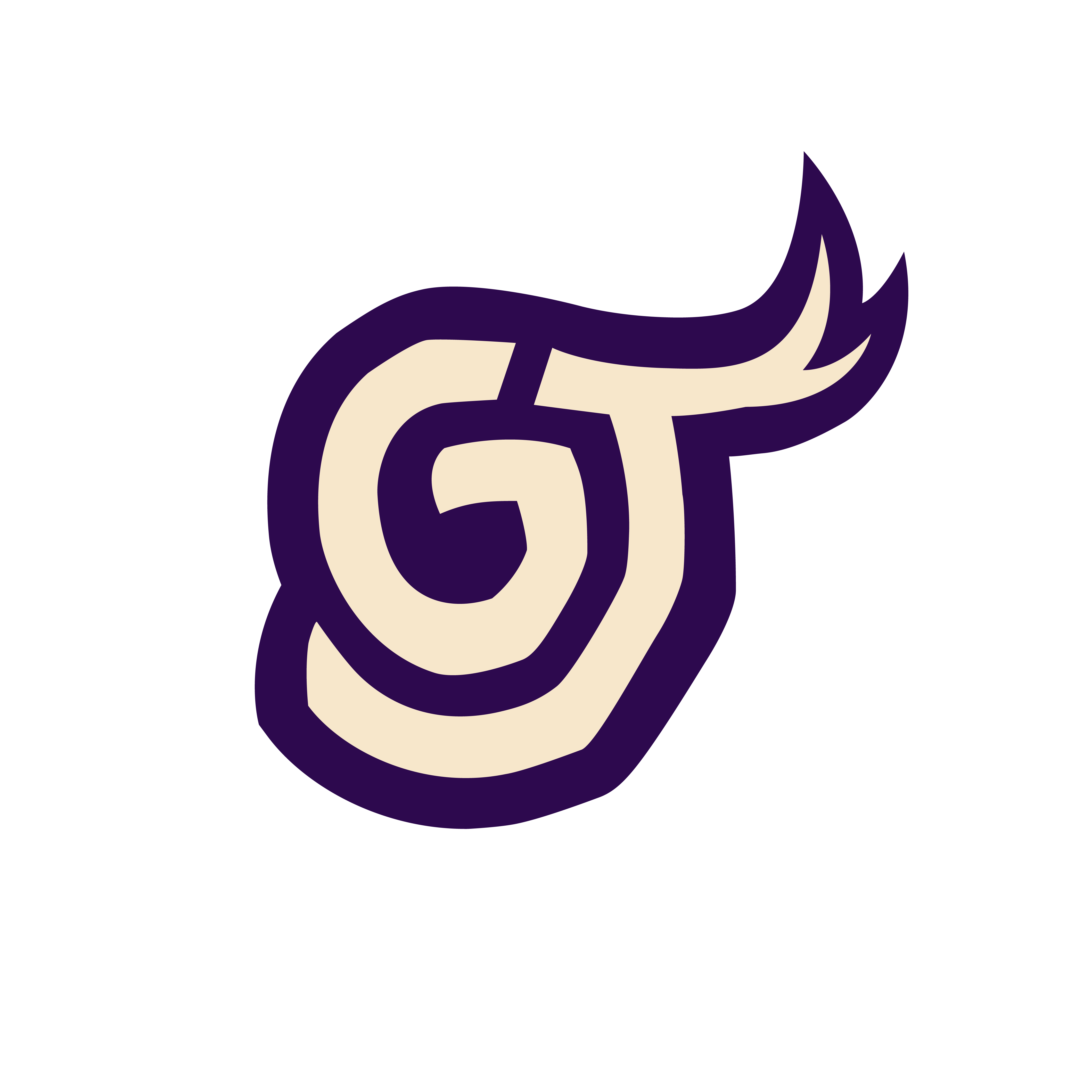
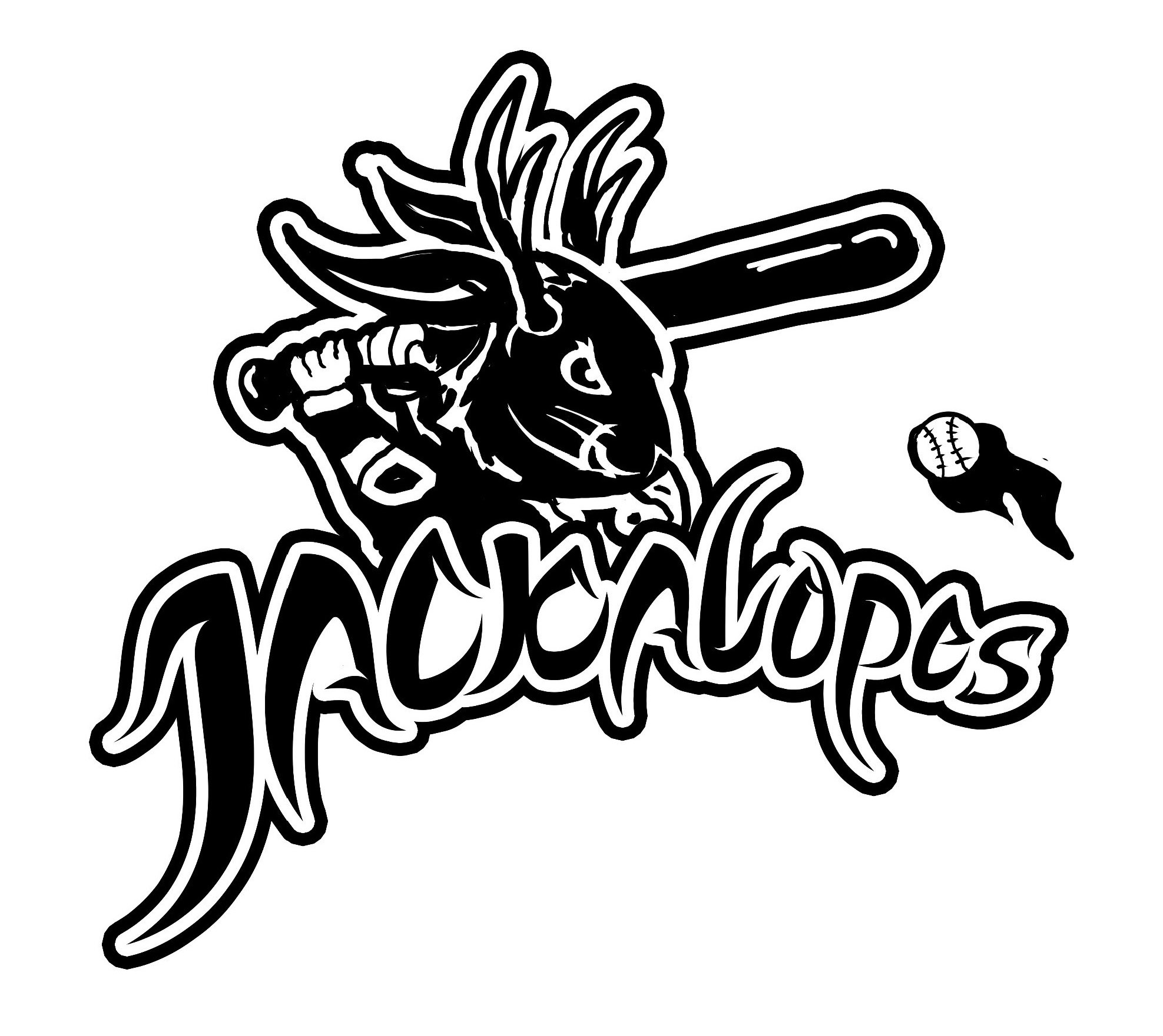
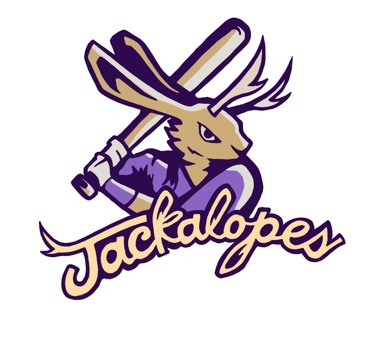
new logo
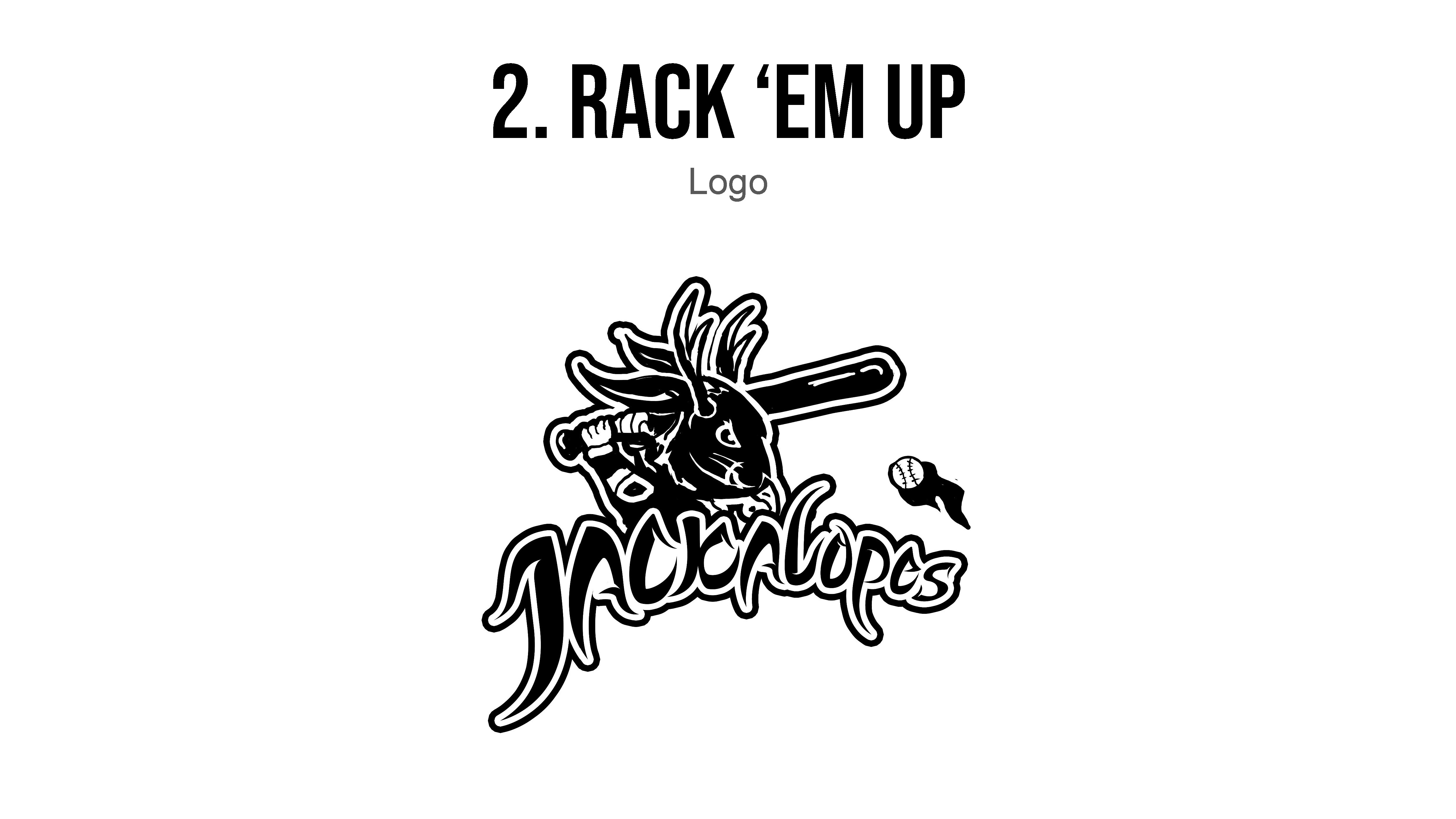
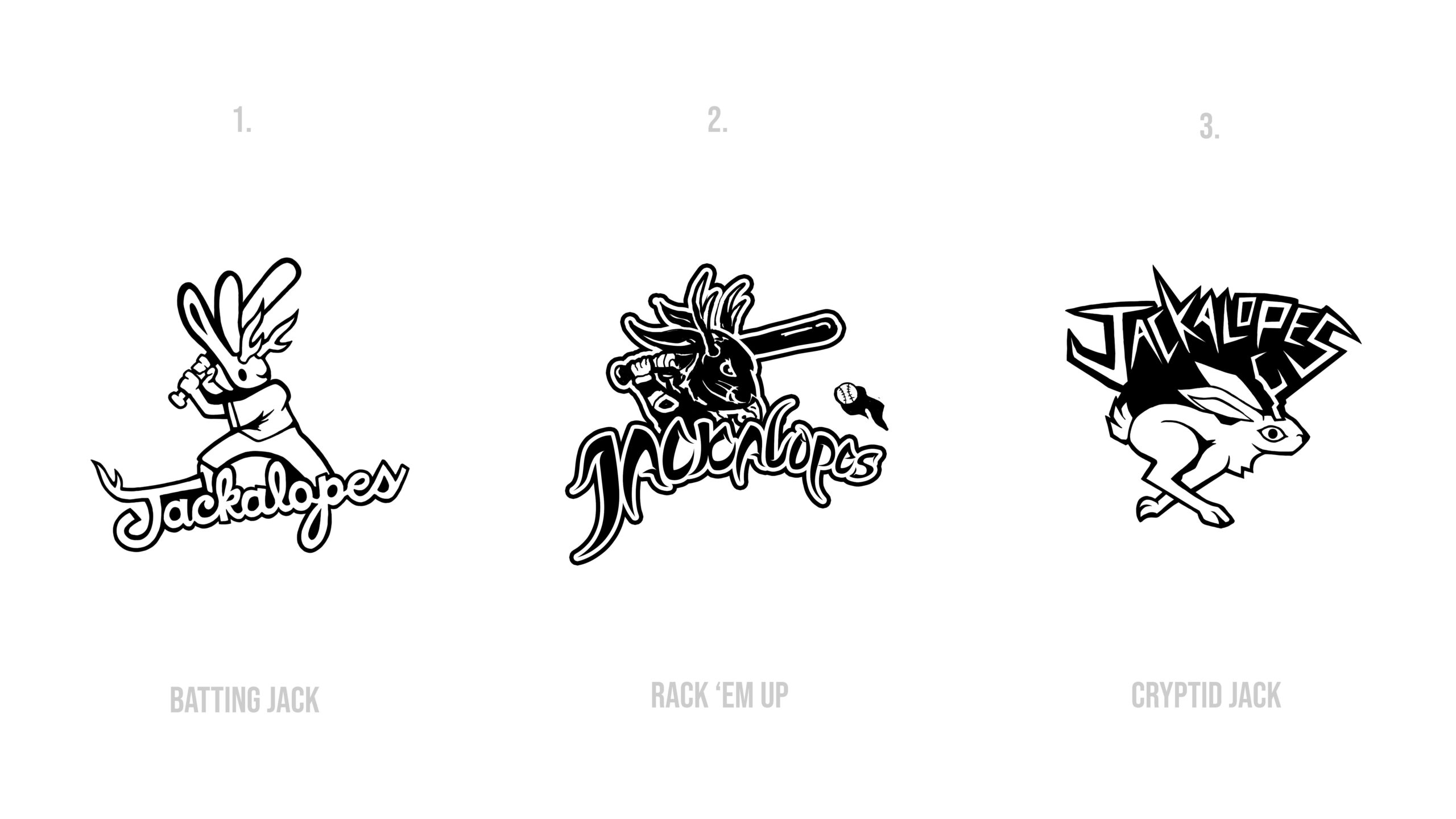
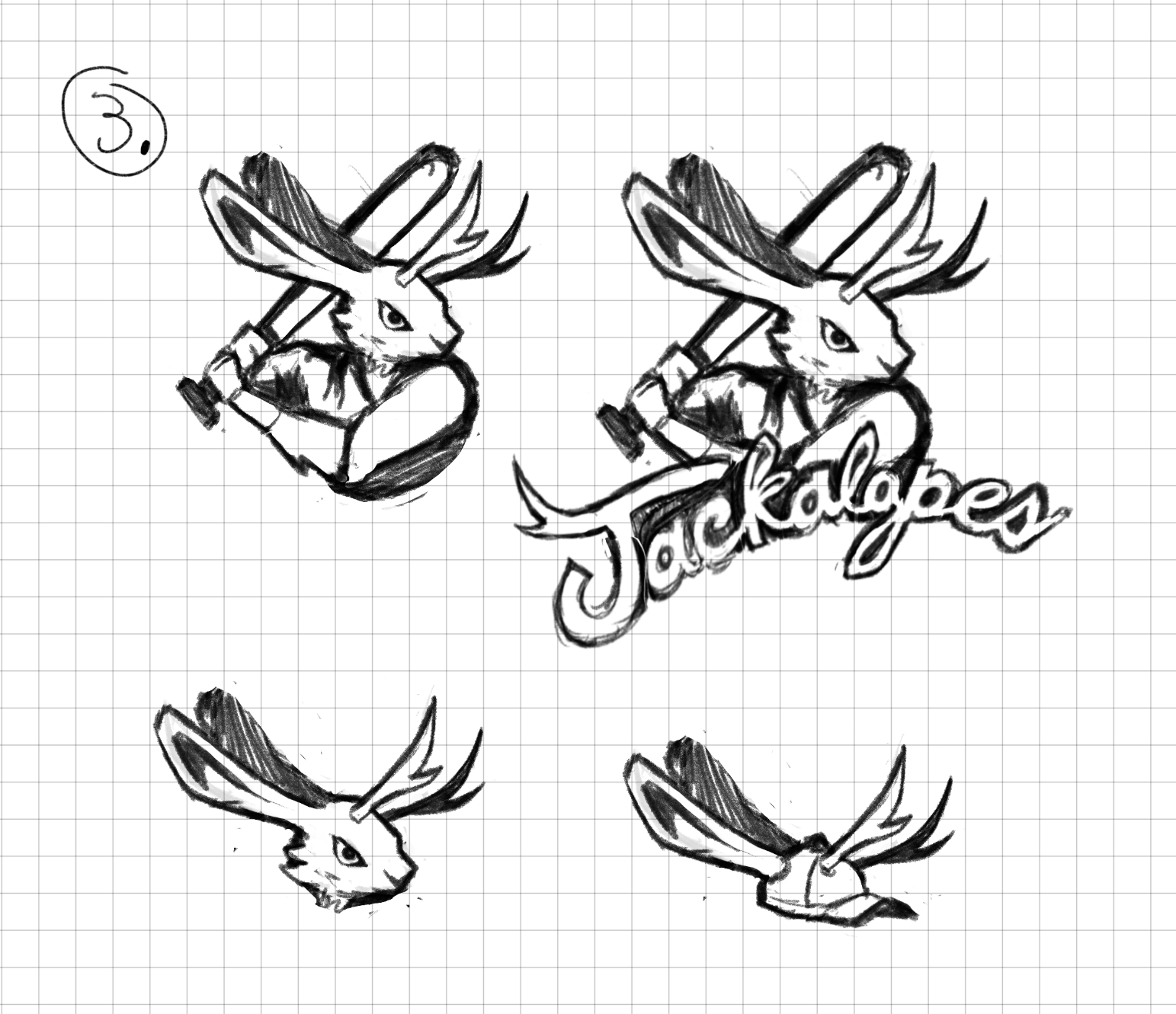
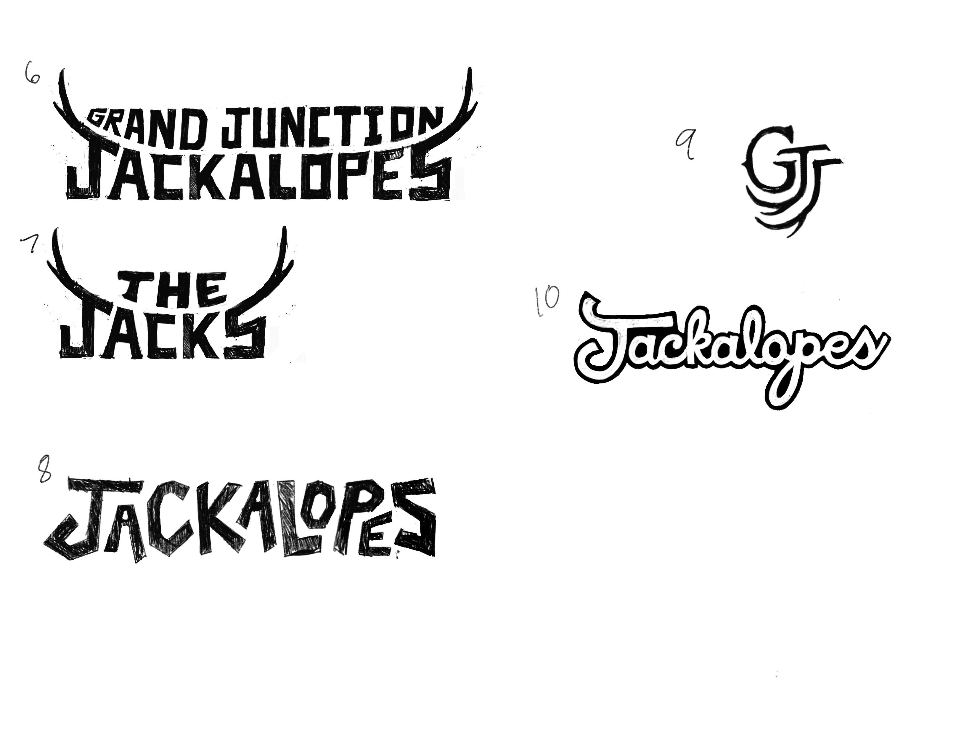
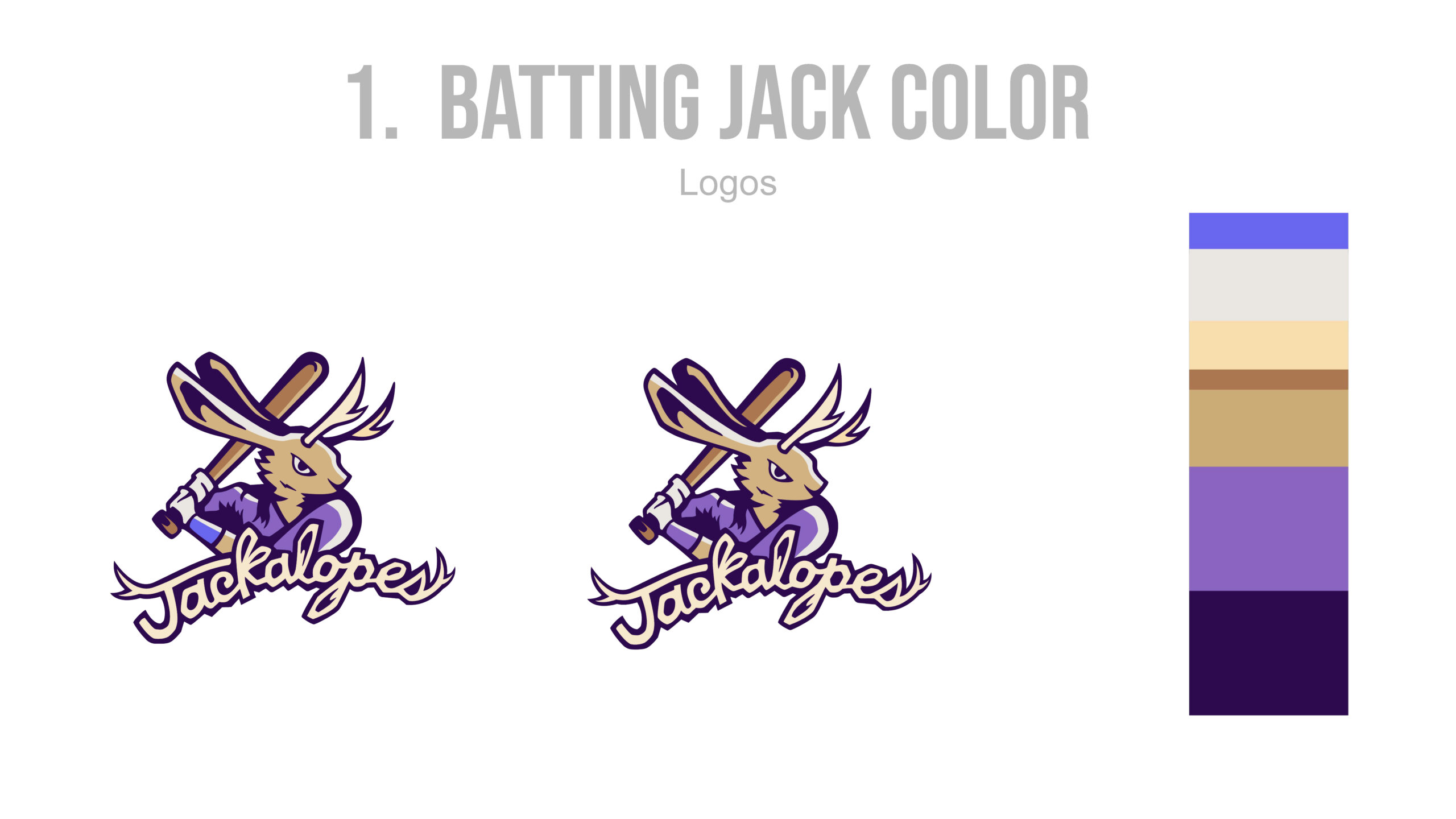
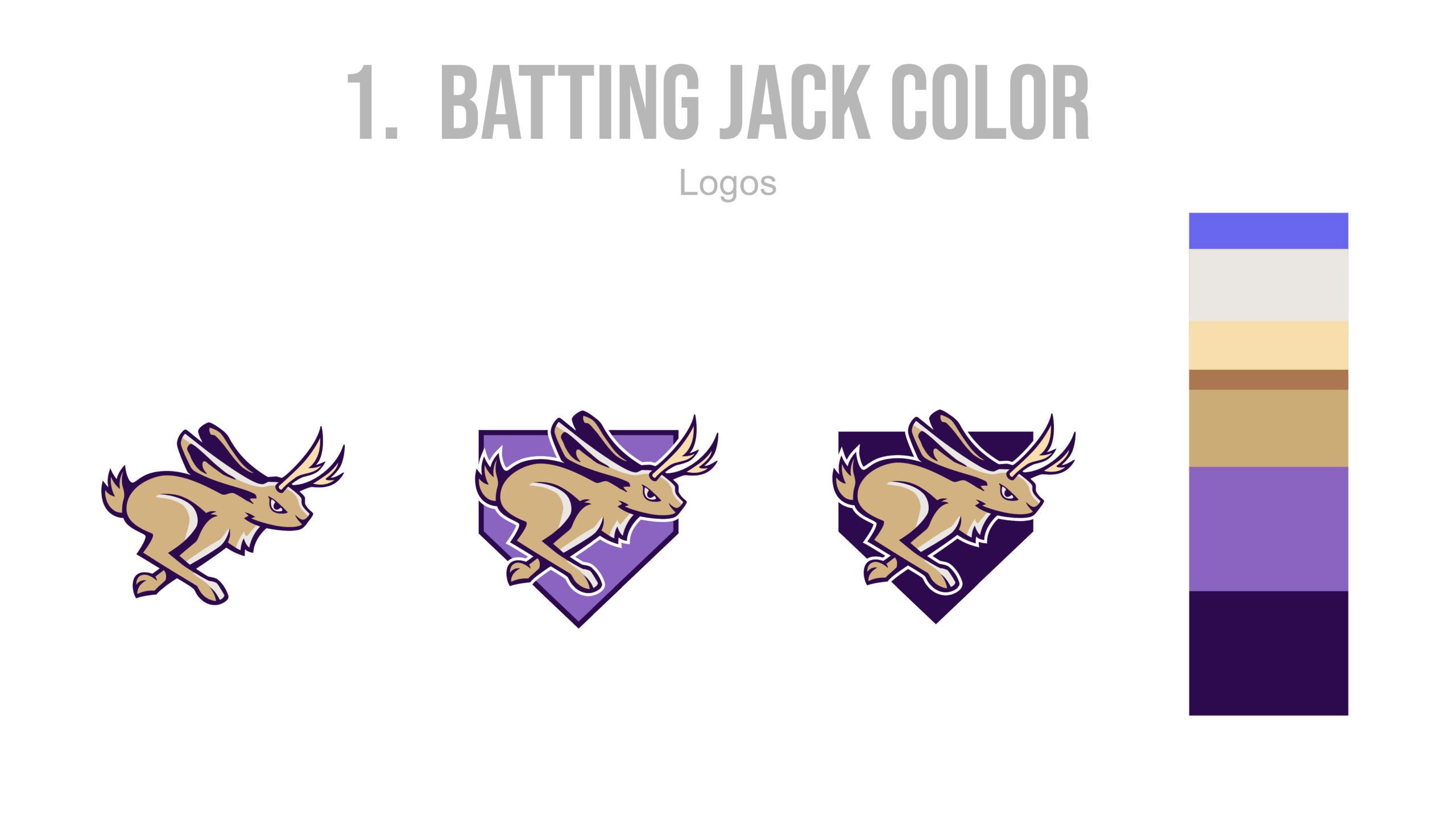
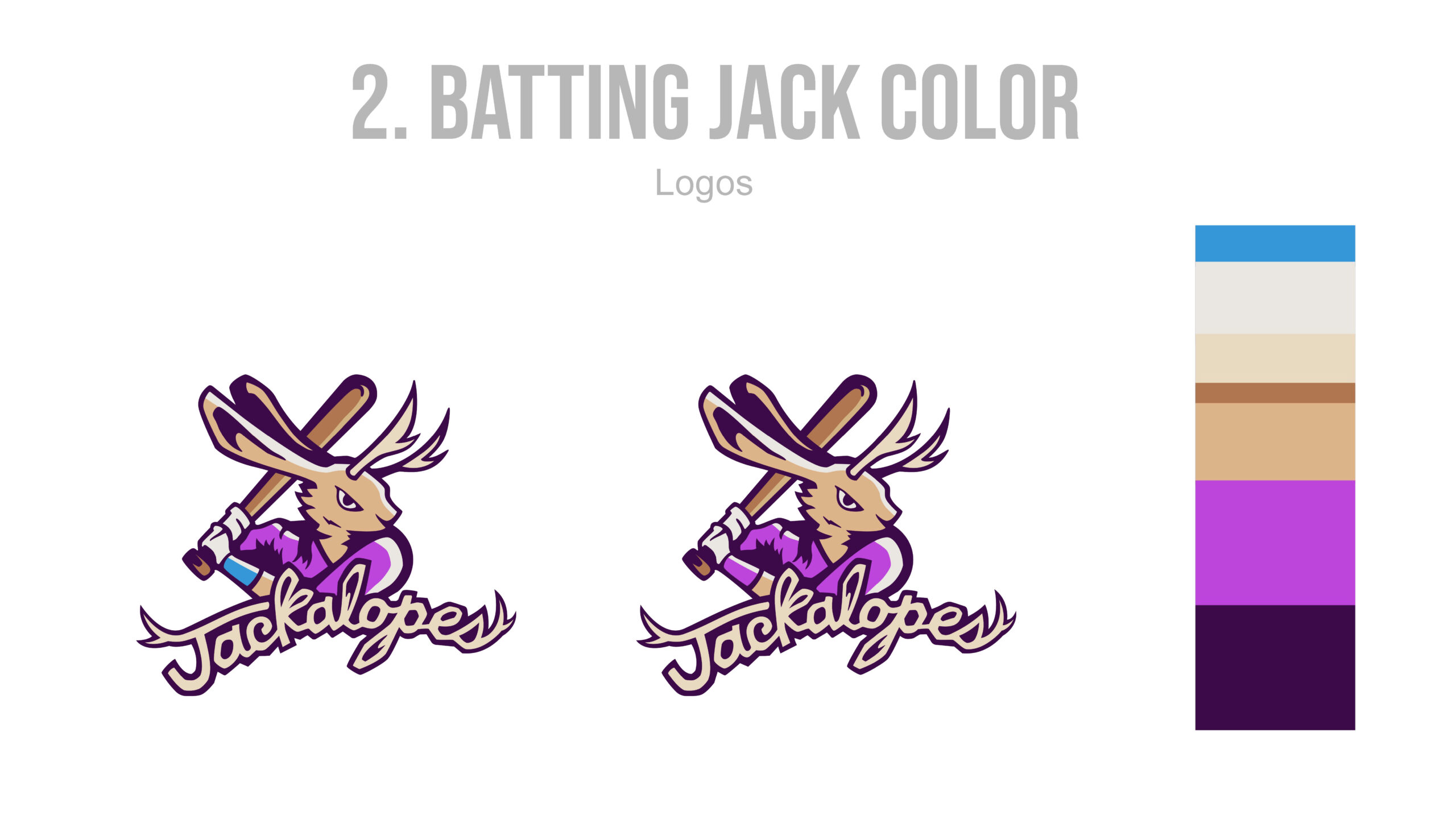
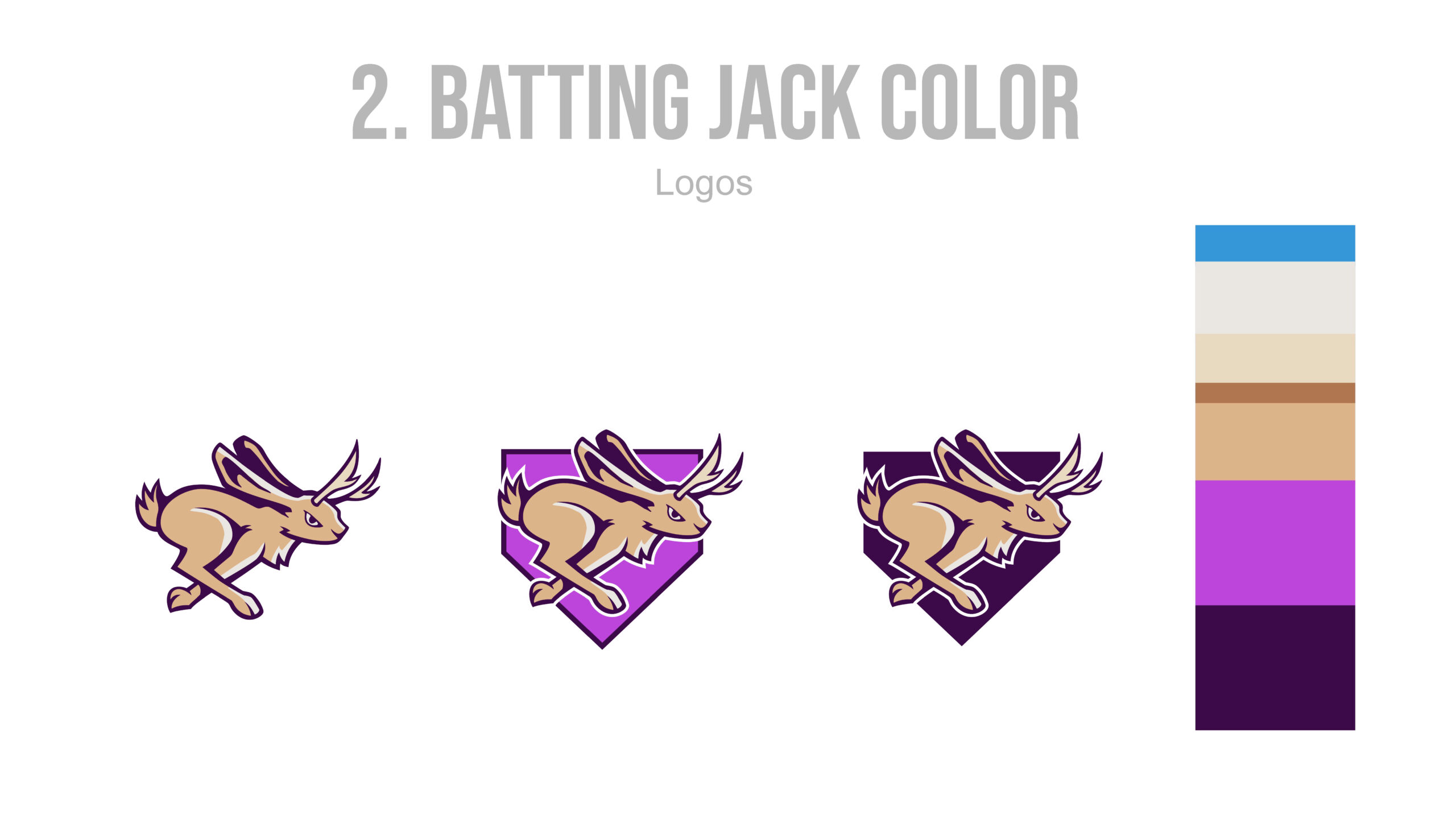
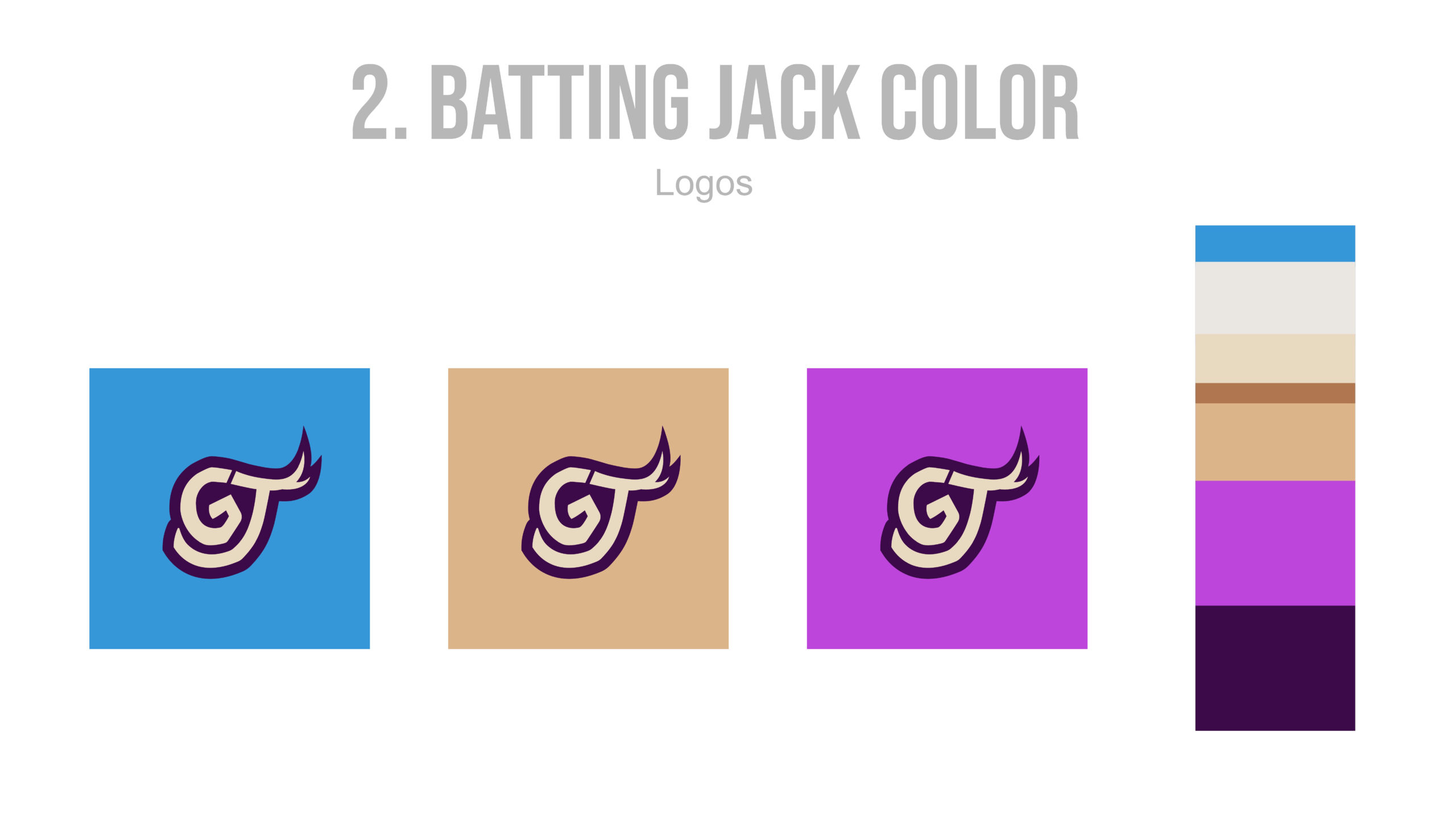
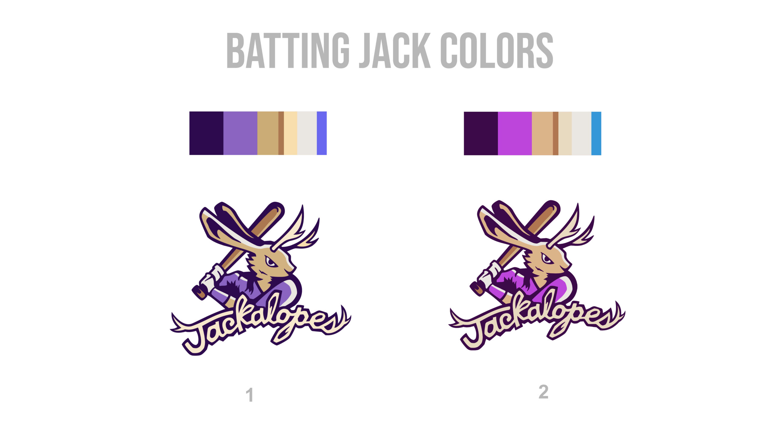
The rebranded Jackalopes logo was presented to the client over the course of three rounds of revisions. In each round, the client selected from two to three design options. The first two rounds focused on exploring different concepts and refining the overall design of the icons and typography. In the final round, the client chose between two color palettes that would best complement the new brand direction.
Round 1
Round 2
Round 3
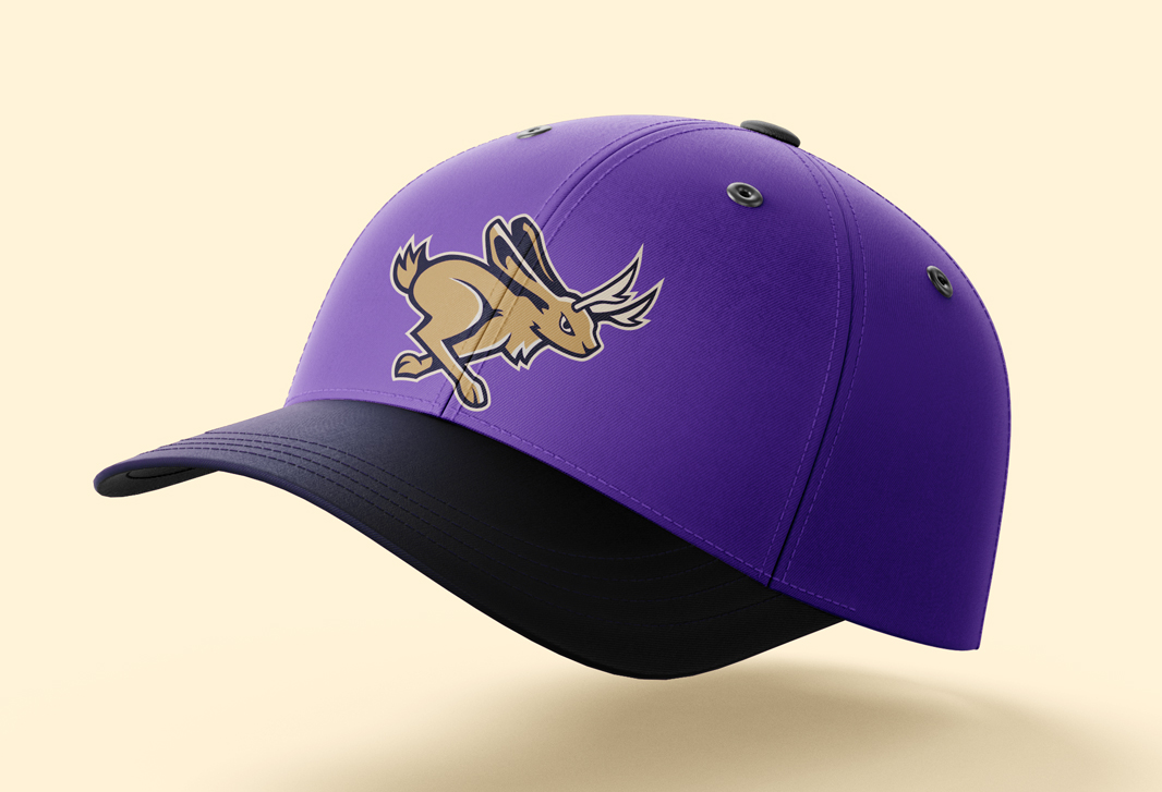
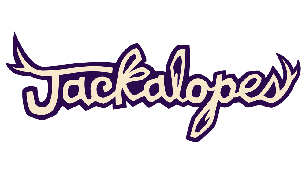
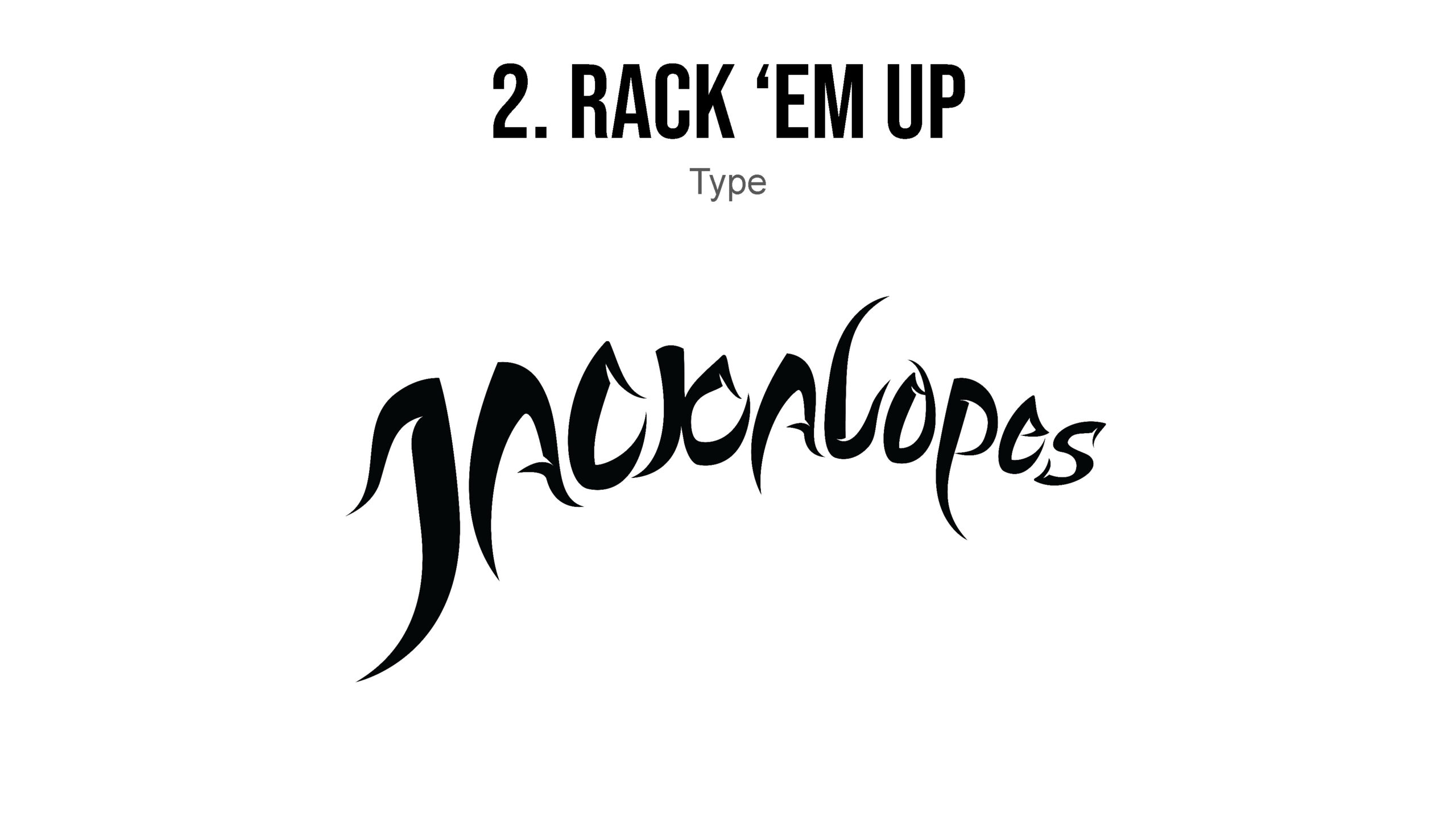
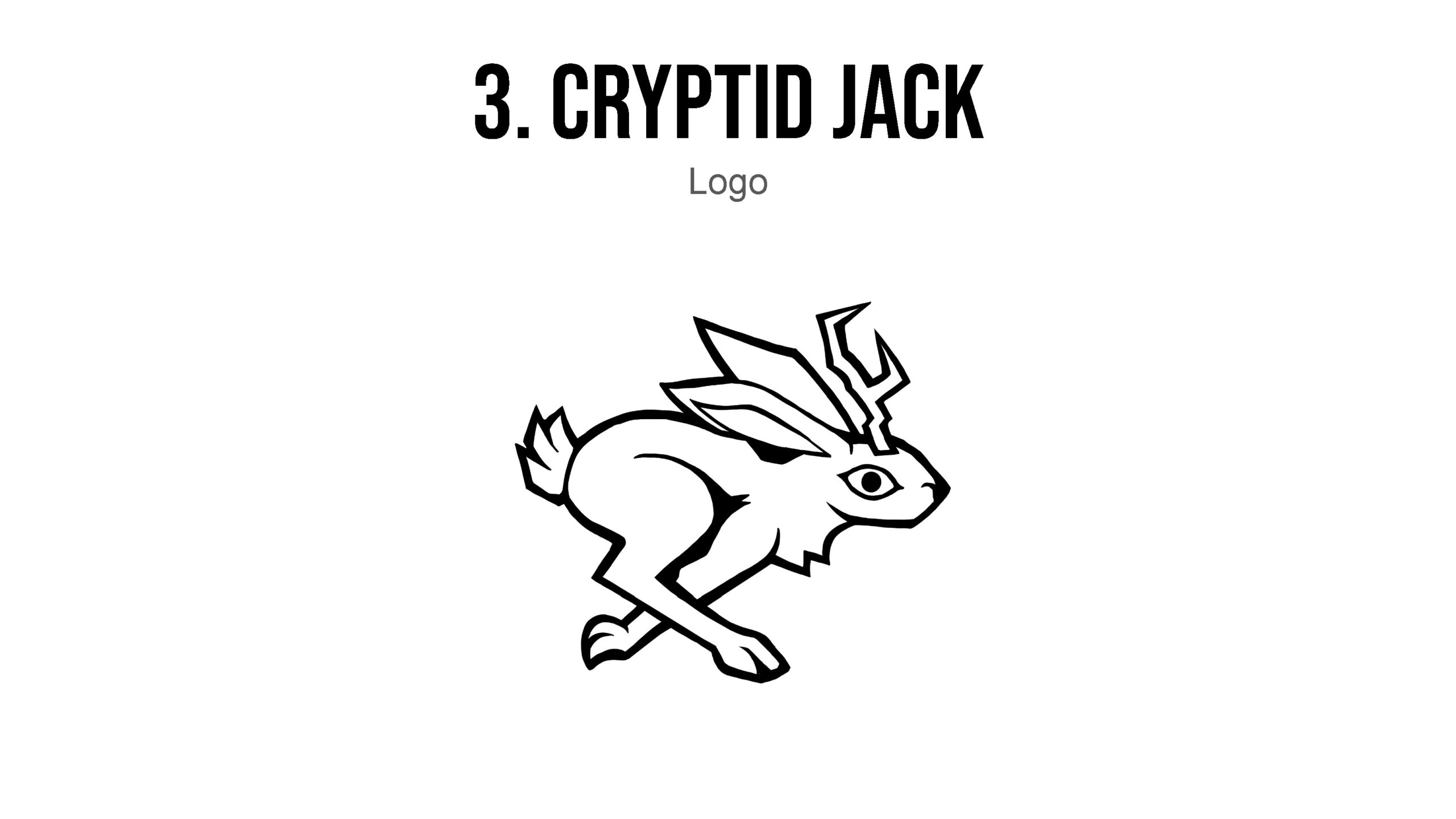
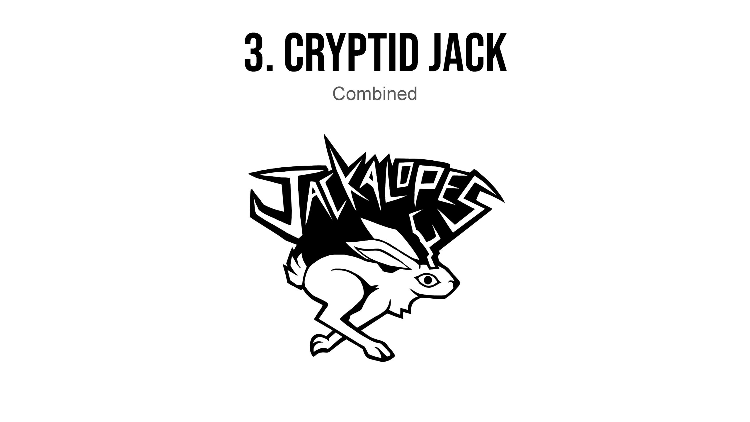
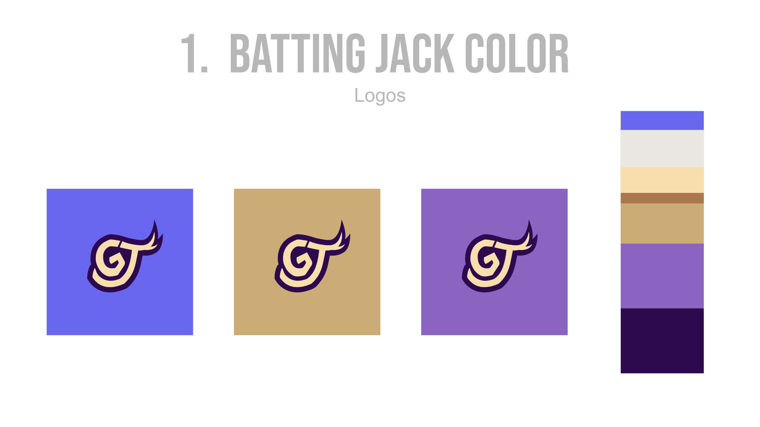
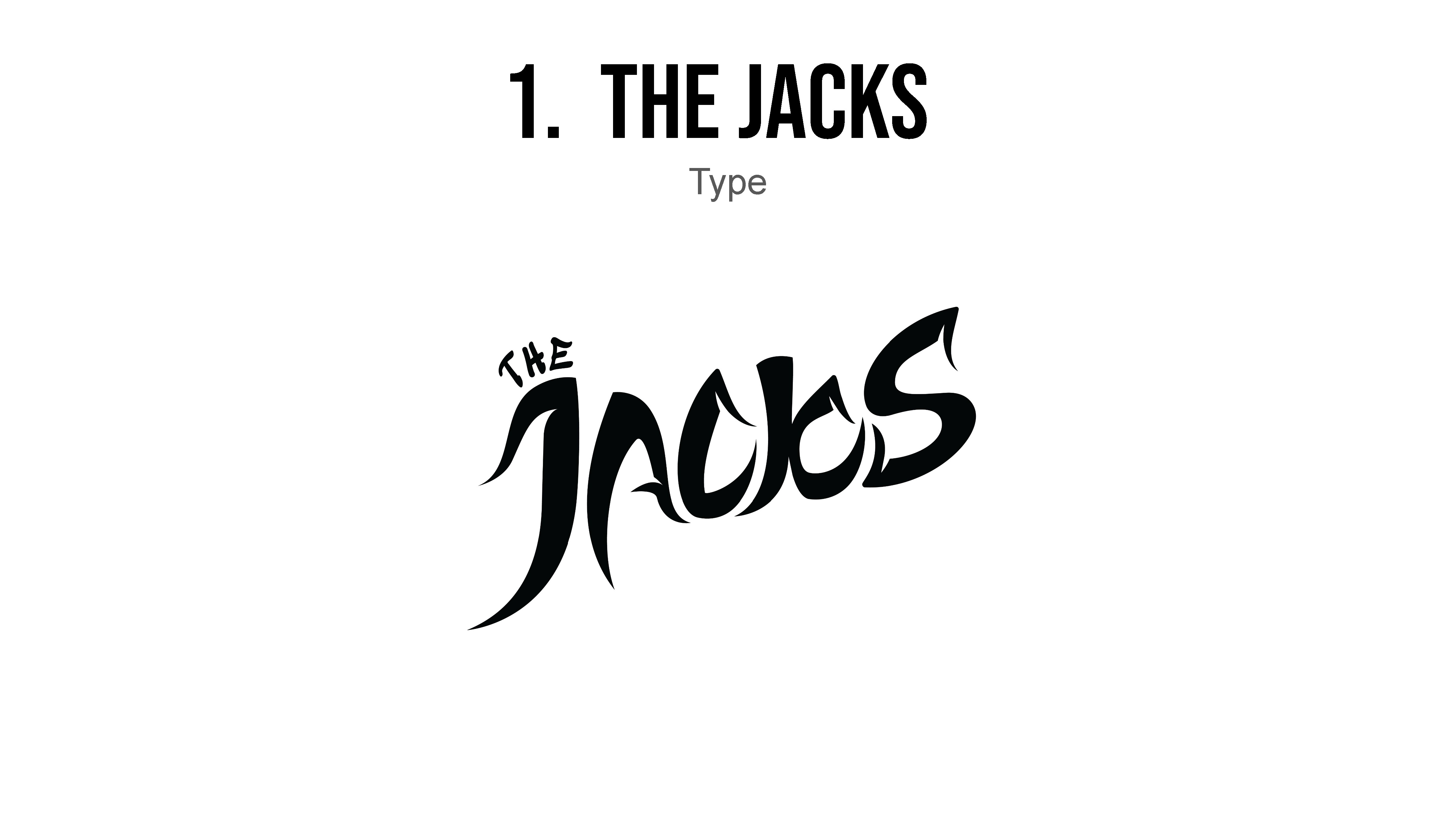
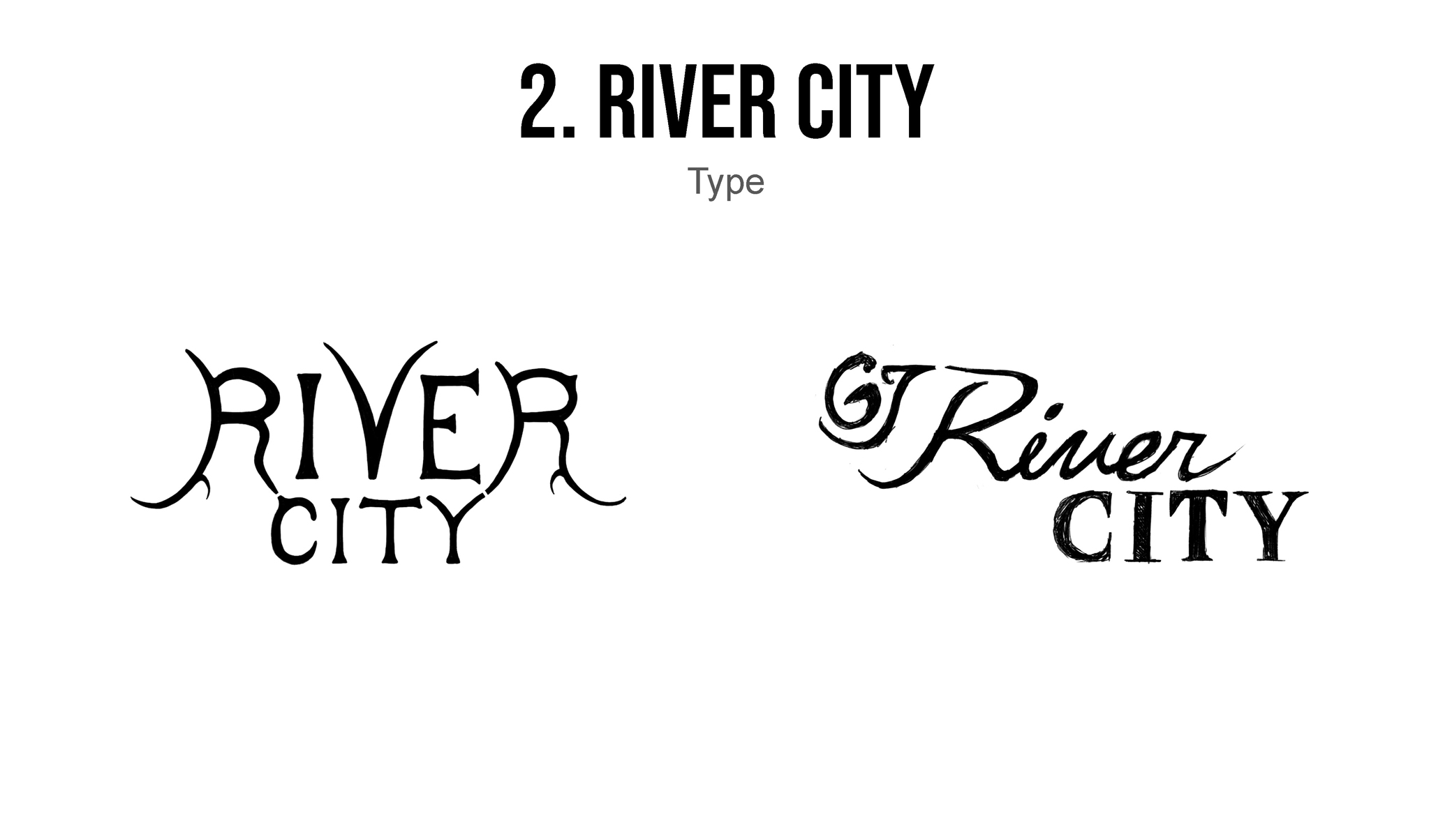
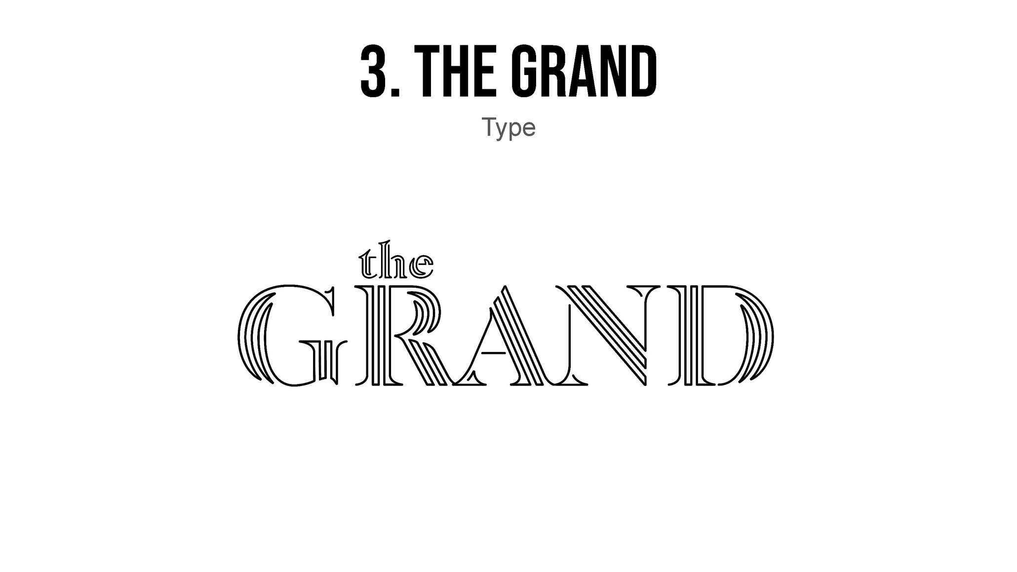
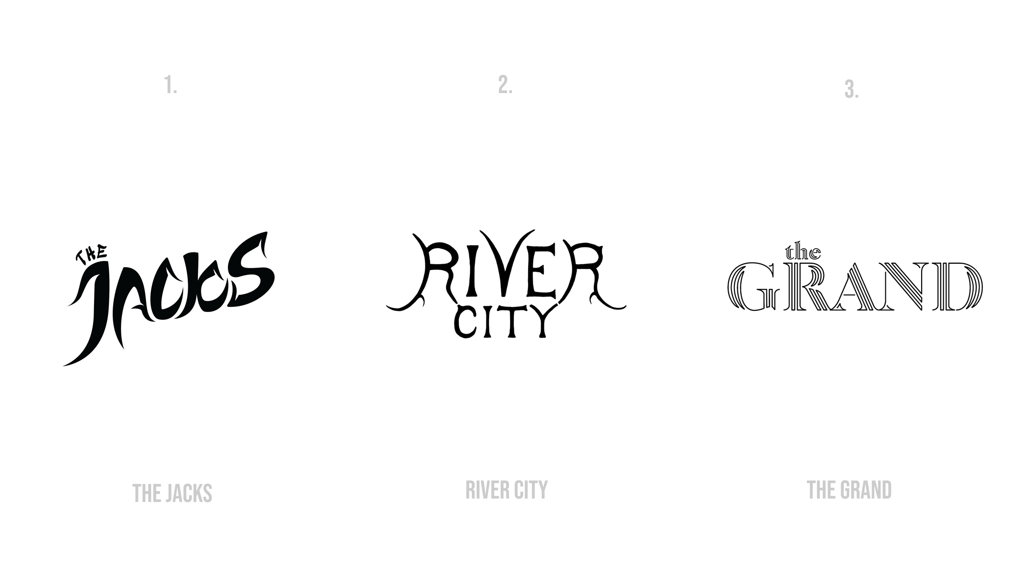
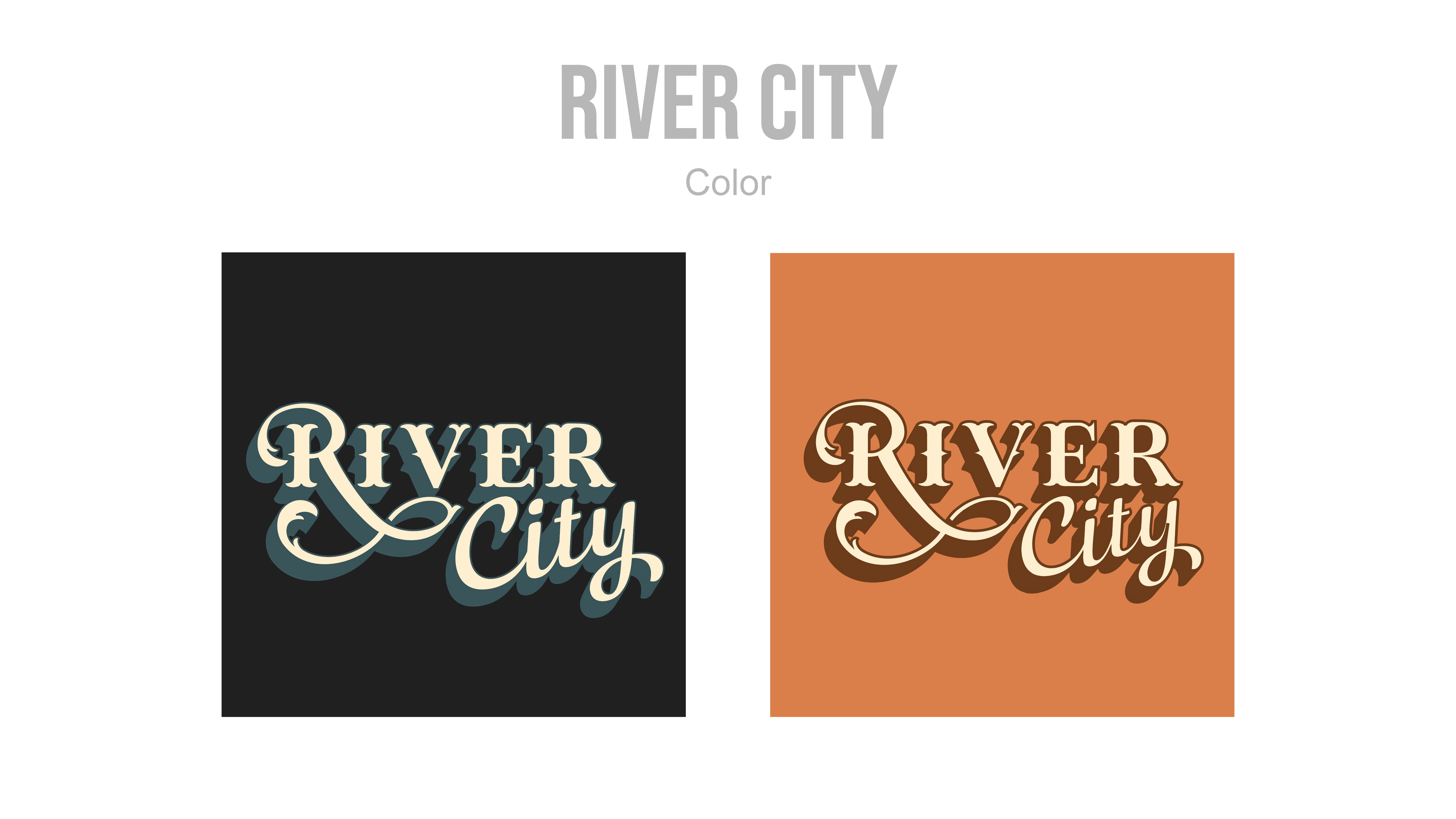
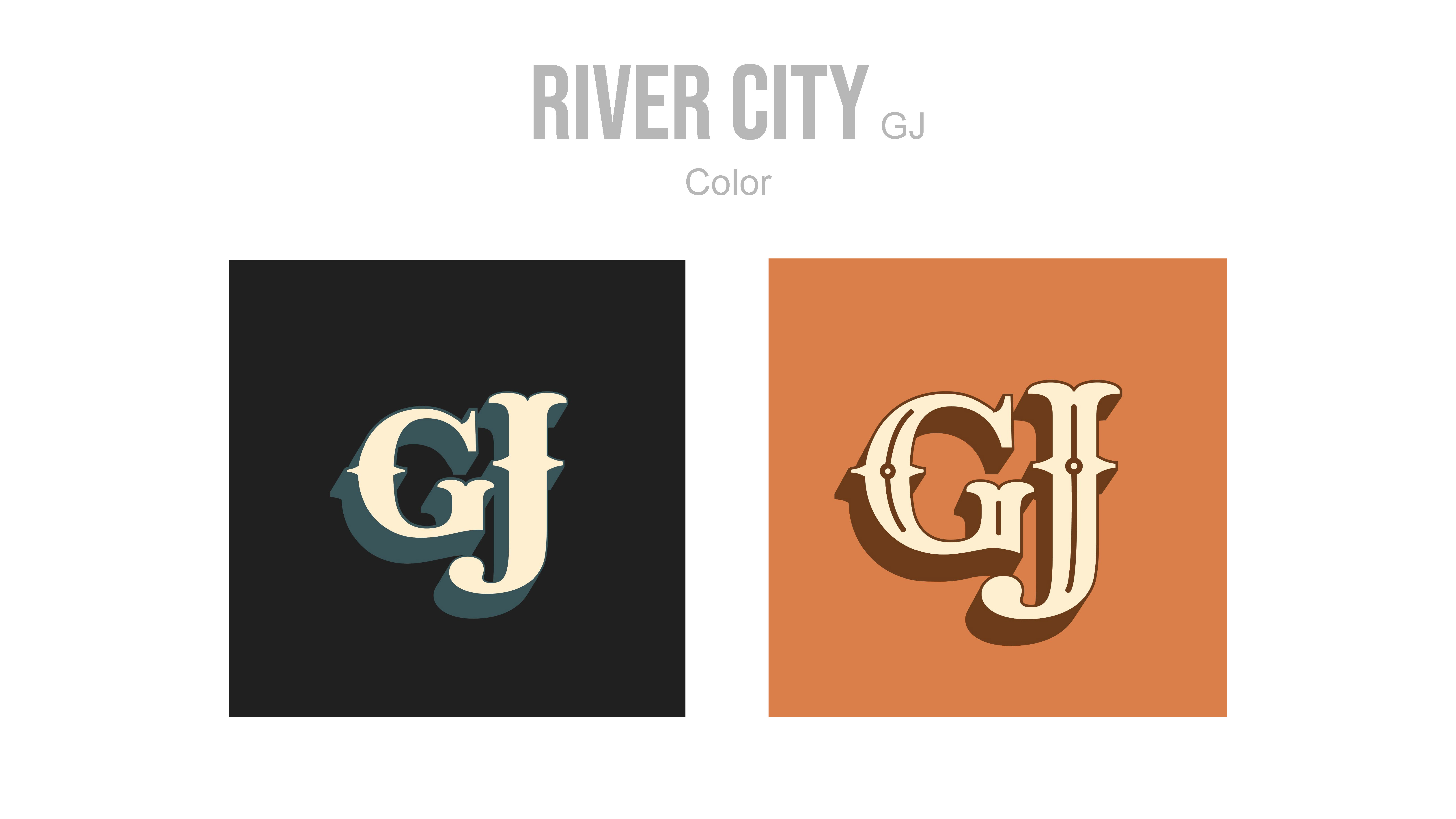
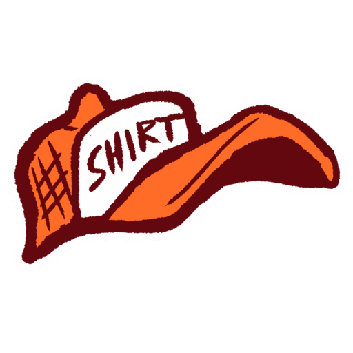
The Jackalopes also requested an additional set of logo designs for a City Connect jersey and related merchandise. This logo was intended to establish a distinct visual identity that would connect the team more deeply with the city and surrounding region. Like the primary logo, this design underwent three rounds of revisions, with the final round focusing on color selection. The logo was developed collaboratively by both designers, with the final design executed by Ryan.